Joe Caramagna is currently the letterer on Daredevil (and many others at Marvel), and I got in touch with him to discuss what is involved with preparing and placing balloons & sound effects for the book and some of his thoughts on several pages from DD501-506. Many thanks to Darediva for her help with scans.
Up first, the Daredevil recap page!
DAREDEVIL recap page |
Kuljit Mithra: While this wasn't your first issue of DD (Dark Reign: The List - Daredevil was), this is your first recap page in the main
title. Is this something you work on, or is this produced in the Bullpen? If you did work on it, some thoughts on the font used and the design? Do
you ever have to do editing on the words to make it fit, or you have to make it fit no matter what?
Joe Caramagna: Recap pages are mostly designed in house by the famous Marvel Bullpen, and sometimes I design the recap pages for the books that I work on. This current Daredevil recap page, however, was actually designed by former DD artist Michael Lark. I LOVE this recap--it really captures the feel of the direction of Daredevil over the past few years, and it's such a nice, simple design. Editorial provides me the updated recap text every month, and it's up to me to grow or shrink the text to make it fit in the space allotted. But I can NEVER edit the actual words in the text myself. If I did, I'd feel the wrath of Steve Wacker! And I don't wish that on anyone! I did design the current DD letters page, but I admit it's a total rip-off of Spidey's! |

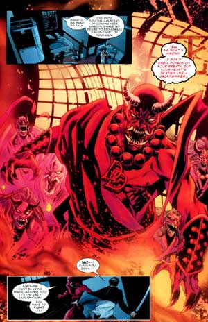
Page from DAREDEVIL 501 |
Mithra: This is a pretty powerful scene for a first issue with the new team. Your thoughts on some of the balloon placements and types and the
sound effect of the "WHUDD!". How do you decide when to join balloons together rather than separate them?
Caramagna: Sometimes the writer asks to have the balloons joined or separated, and sometimes (and this is a very un-glamorous answer) it comes
down to how much space I have. But, yes, sometimes the decision is mine to make if the writer doesn't specify, but the editor always has the final
say. When the balloons read better with a longer pause in between, then I separate them. It's a simple, but easy, way to add drama to a line or a
scene. In some rare cases, the decision to separate balloons is a deliberate attempt to lead a reader's eye along a certain way, whether to draw
emphasis toward something significant, or away from possibly reading panels out of order. I hope I didn't put you to sleep with this answer!
As far as the sound effects go, I love how this "WHUDD!" is red because aside from Daredevil, it's the only red in the panel. Usually I take a "soft"
sound effect like "whudd" or "thud" and I color it with a muted color to get the feel of the sound across, but in this case our buddy Matt is
surprising him with a quick, hard jab and I felt that the bright red would get that point across. And the color also happens to look nice against
both the yellow and the black in the background.
|

Page from DAREDEVIL 502 |
Mithra: This page has only has one balloon, but you could have chosen to present it in so many ways. The "Take them all", even in regular size
here still conveys the seriousness of what DD is saying. Did you experiment with different size, placement, font, bolding?
Caramagna: This is an easy one. First of all, Andy Diggle didn't write it as a scream, and Roberto didn't draw it that way, so there was no
reason for me to play with the size or to bold anything. It's not my job to draw attention to the lettering, my jobs is to get the writer's point
across and stay out of the artist's way! There have been times on a cliffhanger page with one balloon where I do make it large and ultra-dramatic,
such as in Amazing Spider-Man or Guardians of the Galaxy, but those books are VERY different in tone from Daredevil. Basically, on DD, I play it very
straight. Not many burst balloons when people are yelling, and no overly designed sound effects, because that's what Daredevil is--he's not flashy,
he's not overly emotional, he is all business. Compare a DD book to another that I letter and you'll know exactly what I mean.
For every title that I letter I keep a set of rules for that particular book to not just keep the tone of the character and the title, but to also
serve the writer, artist and colorists well, and not hurt them. So you'll notice that Captain America's lettering looks VERY different from Avengers:
The Initiative and Amazing Spider-Man looks very different compared to The Punisher, yet when you read those books, the lettering itself isn't overly
designed, it's fairly simple. Some letterers like to pride themselves on being artists or designers, but I'm not lettering to show off--nothing that
I do will make the book better than it is, but there's a lot I can do to make the book worse. And it's my job to make sure I don't make it look
worse. Some letterers may disagree with that statement, but the simple fact is that nobody buys a comic book because of the lettering, so get over
yourself, haha.
|
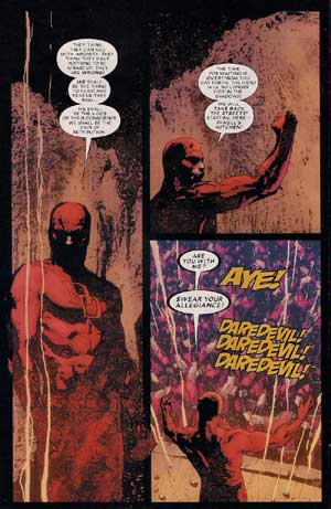
Page from DAREDEVIL 503 |
Mithra: I chose this page because it seemed to have a bit of everything... connected balloons, bolded balloons and text and then the chanting
of "Daredevil". Maybe you can go into how the sound effects are created? Do you create a font, or do you have one that you usually use, etc.?
Caramagna: Just about all of my fonts were created by Chris Eliopoulos, and that includes the font used for the chanting of "Daredevil!" Actually, looking at this page now, the art is so textured, I wish I could have done a bit more with the color of the chants. But, sometimes time becomes a factor and you have to do the best you can in the time you have available. I don't like this page! Why did you pick it? Haha! |
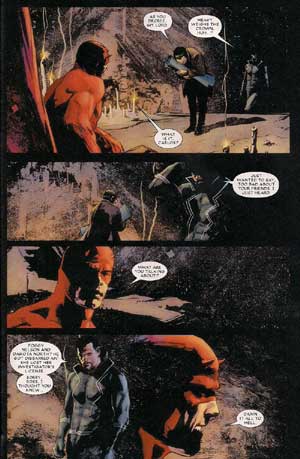
Page from DAREDEVIL 504 |
Mithra: I was drawn to this page because there is quite a bit of space surrounding the balloons themselves, making the underground hideout
seem larger than it is (maybe it's just me). You didn't try to fill up the panels with extras. I guess this is a welcome thing for you, since I'm
sure you've experienced panels where the artist didn't leave enough room for the dialogue.
Caramagna: This page is actually a good example of the way I try to do balloon placements. In the first panel, Black Tarantula's balloon is as far left (as close to the Hand guy's balloon) as possible, and Daredevil's balloon is as low as possible to make sure the reader reads Tarantula's balloon 2nd, and Daredevil's 3rd in that panel. Also, if you trace the balloons on the page in the speaking order, they actually make nice "S"-like patterns to keep the reader's eye moving all across the art. In the last two panels, Black Tarantula's balloons are high in the panel, and Daredevil's balloon is low, which makes an easier "S" transition than a harsh horizontal line. It's a subtle touch that nobody would notice unless they were looking for it, but it's something I try to do to keep the reader's eye moving smoothly around the page. Had I put Daredevil's balloon higher, the reader might have been taken out of the story bit and not know why. The natural thing to do when looking at a person is to look at his eyes first (yes, ladies, we naturally look at the EYES first, even if we look elsewhere right after). If you're looking at the art and go from Black Tarantula's eyes to Daredevils eyes in those last two panels, it's much smoother to look at where the balloon is now rather than make the reader shift his eyes upward again to read the balloon. Again, the reader would never really know why he was taken out of the story for a second, it's that subtle. Aaaaaannnnndddd I just put you to sleep again! |
Page from DAREDEVIL 505 |
Mithra:
How do you feel about the "devilish" font you used here and throughout the issue?
Caramagna: How do I feel about it? I obviously love it or I wouldn't have used it! Haha. Trivia: This is the same font that I use for Gorgon in Marvel's cosmic universe books! |

Page from DAREDEVIL 506 |
Mithra:
And the last one: Only because I was actively looking for some different lettering... I noticed this one because you made one balloon split between
two panels, right in the center. Did you not place it more to the right because Bakuto is centered and the balloon would be too far over? Only asking
because it wasn't placed under the "mercy" balloon, which would lead down to the picture of the Hand ninja's face.
Caramagna: This really came down to readability. If Bakuto's balloon were kept entirely in the panel, it would have been hard to figure out which balloon was meant to be read first at first glance. The only way the reading order would have been clear is if the balloons covered up the major action in the middle of the panel. By overlapping Bakuto's balloon into the next panel, it makes it clear that he's speaking during the shot transition. I'm sure there's no one right way to do this and different letterers would handle it differently, but a lot of it comes to personal preference. I quite possibly could have kept both balloons in the panel somewhere and then snaked the tails around to avoid covering the art, but then I might have been distracting from the art by making it obvious I was trying to avoid covering it. Sometimes you have to go with the lesser of two evils. |
Mithra: Thanks for doing this interview. You may think your answers are boring, but I found it interesting!
Caramagna: Thank you! And be sure to check out a couple of things that I've written: Iron Man & The Armor Wars is still on sale in comic shops and book sales everywhere (written by me, with art by Craig Rousseau), including Amazon.com, and in the next two weeks Marvel.com will have an Amazing Spider-Man digital exclusive comic on the site , written by me, with art by Todd Nauck! And you can find more of these nuggets of wisdom on my twitter (@JoeCaramagna), or on Facebook (Joe Caramagna). Thanks, and keep reading Daredevil!
----------------------------------------------
(c) Kuljit Mithra 2010
Daredevil:The Man
Without Fear
http://www.manwithoutfear.com
----------------------------------------------

Daredevil (and other related characters appearing) and the
distinctive likenesses are Trademarks of Marvel Characters, Inc. and are
used WITHOUT permission.
Copyright © 2024 Marvel Characters, Inc.
All
Rights Reserved. Visit Marvel.com.
www.manwithoutfear.com is owned and operated by Kuljit Mithra.
Web site is © Kuljit Mithra 1996-2025.
Keep up to the date with your trusted Daredevil source ManWithoutFear.com on  and
and